The brief
Local shops and practitioners are suffering a decrease in the demand of their services and products due to the extreme situation COVID-19 pushed worldwide. This can affect local economies and many families. Alongside this, we can see true intent and a growing trend to support local businesses in many communities. Online presence is a good way to hijack the issue. More and more professionals are on the verge of their digital transition.
Let’s help local shops and professionals improve their online presence to be more competitive in the actual market.
The challenge
Design a desktop website for a local business or professional. In this project we’re focusing our efforts on organizing the information in a clear way, to be most effective for both the customer and provider. Also, we want to tackle Interaction design patterns to make the exchange as streamlined as possible.
My team

For this second project, I was put in a group with my friends Andréa and Julie, whom I didn’t really know yet as the remote bootcamp had only started a week before. However, in our job we work with all kinds of profiles, and as long as we remain open-minded, the possibilities of nice surprises are still very great (this was again the case here)! Our task for the weekend was to find potential customers. We were able to present the opportunities we had found to our classmates during the weekend, and the Salive project quickly emerged as the most inspiring.
Local shops and practitioners are suffering a decrease in the demand of their services and products due to the extreme situation COVID-19 pushed worldwide. This can affect local economies and many families. Alongside this, we can see true intent and a growing trend to support local businesses in many communities.
Online presence is a good way to hijack the issue. More and more professionals are on the verge of their digital transition.
Let’s help local shops and professionals improve their online presence to be more competitive in the actual market.
What is Salive?
Salive was created by Natacha and Lola, founders of the Ravages studio, who are passionate about gastronomy. They created Salive during the first lockdown when they wanted to offer people a way to travel a bit, despite the restrictions that were put in place to counter the COVID. With this concept, they propose to people to rediscover a district of Paris in more depth, as well as to taste food prepared by local restaurant partners, thanks to an itinerary cleverly designed by the two girls.
The subject immediately appealed to all three of us, as food and travel are obviously subjects close to our hearts. We may have been able to get in touch with Natacha and Lola very quickly. And it went superbly. We were really taken with the project and there is a lot of creative potential.
We quickly noticed that Salive’s instagram was very pretty, but that the site lacked a lot of that energy and dynamism. This is something that needs to be addressed, as the two founders are two very competent, willing and deeply creative women designers, we need to be able to offer them something that matches their personalities, but also that of their very promising concept that could really work well in Paris (and elsewhere).

VS

Competitive analysis
First, we had to study the market. Who offers similar products? The biggest competitor here is AirBnB, which offers culinary and cultural experiences. It works a bit more like a marketplace system, everyone may offer their experience, a singing lesson, a walk in the woods, a guided tour of unusual Paris, wine tasting etc… There are as many experiences as there are people offering them! This can sometimes seem impersonal and lacks visual identity and character.

It will not be difficult to stand out from a giant like AirBnB because Salive offers things that are much more local, more personalised, because it is the founders who create partnerships with the restaurateurs, according to their own tastes.


The other potential competitors seemed to us to address a much more touristy clientele. Tours of busy areas such as the Marais, near the Eiffel Tower, the Champs Elysées… These districts, even if great, do not really reflect Paris and its atmosphere. Moreover, it is not at all the same budget, almost three times more than Salive, so 100€ per person. In terms of the websites, it was also not very personalised, it really looks like an interface for a tourist activity in the broadest sense of the term. The photos are very archetypal of a somewhat fantasized Paris, it’s quite clean and mass-market.
The users
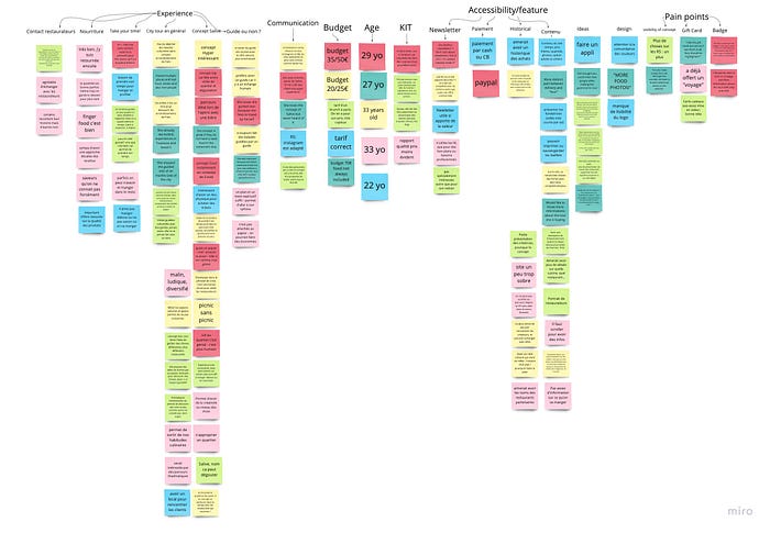
We were lucky enough to be able to get in direct contact with people who had done food tours with Salive and other users with AirBnb, and we conducted about 6 different interviews. We were able to get a lot of different things out of these meeting, the subject seems to inspire a lot of people in Paris (french people talking about food and culture, how surprising!). We categorized and grouped everything into an affinity diagram so that we could see a bit more clearly through the flood of information we had received over the two days.
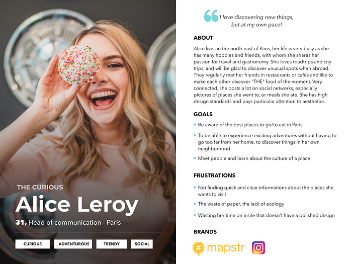
After sorting the information we received, we have created an archetype, a mix of everything we had heard from our interviewees, the things they like, their frustrations, how they consume food, how do they travel etc. This is how Alice, our persona, was born!
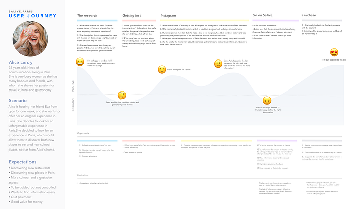
When could Salive be an interesting concept for Alice? Why would she want to use it? We have created a user journey to highlight the potential concerns Alice will have when she wants to book an unusual activity for a friend of hers who doesn’t know Paris and is coming to visit her.
Alice can’t find anything she wants on the usual sites, until she comes across an Instagram story of one of her friend.
After understanding who our target audience was and how Salive users functioned, we looked at what the problems were, and developed a solution:
Problem statement:
Salive was designed to sell people gastronomic and cultural tours in Paris.
We observed that the site does not offer users accurate information on the products, which causes confusion for them and therefore, a lack of profitability for Salive.
How might we:
How might we communicate effectively to get more visibility on the concept ?
MVP (minimal viable product)
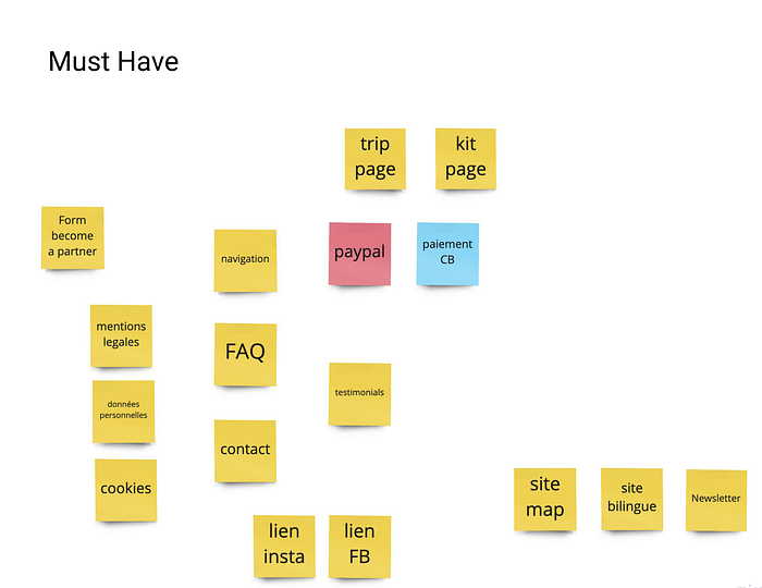
We then prioritised the many features that came to mind, using the Moscow method.
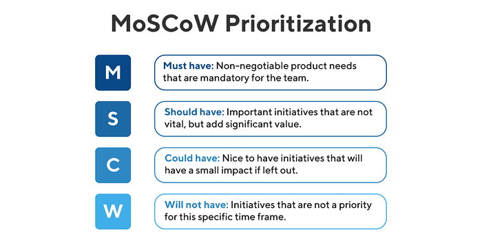
It wasn’t necessarily easy because we wanted to do everything, and it was difficult to put features as “could haves” when we were dreaming of putting them into shape.
MVP statement:
The aim of the Salive website, at the bare minimum, is to allow users to book food and culture tours of Paris according to a specific itinerary, or to buy recipe kits for a home experience. By knowing what is available, the website further aims to encourage consumer action. Therefore, we must do the following:
Create two pages, one that includes the tours, the other that explains what recipe kits are available and to have a payment system. More information needs to be included so that users are very aware of what they are buying.
By ensuring that these things are available, the user will be able to review and purchase products with full knowledge of what is available to them.
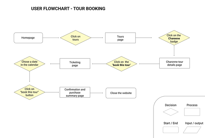
After our MVP, we created a “happy path”/user flow. This helps us to see which page should be designed as a priority. We have chosen to make “a user who buys a tour” on the site :
Prototypes
Thanks to this user path, it was now easier for us to visualise the pages necessary for the proper functioning of a tour purchase. We then drew up a few sketches, so-called “low fidelity” prototypes, which are a long way from what the final product will really look like, but they help a lot to make a project concrete and allow quick changes.

Once we were satisfied, we tested our prototypes with users who gave us very interesting feedback:
- Adding a Book button on the route details page because it was much too late
- Adding several back buttons on different pages
- “You provide a summary of contact details but I never had to enter them, is that normal?”
- “I don’t understand if it’s the most popular courses or all those available?”…
Once the tests were successful, we may have improved our prototypes, and this time created medium fidelity visuals.

Take out your brushes, it’s UI time!
What could be more satisfying when faced with a blank canvas than to have a mind full of ideas?
However, there is no question of doing things randomly. We need to know exactly what colours to use, as they all have a meaning and convey particular messages. What does our brand want to say? What values and moods does Salive want to communicate?
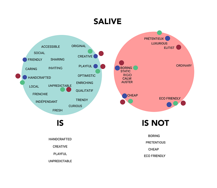
We tried to analyse our brand. What did it inspire us? What were the keywords it was linked to? We made lists individually and then voted for the ones that we thought best represented what we had in mind.
Moodboard
Once we had agreed on the most relevant adjectives, we created a quick moodboard and then blind-tested it with our class (“what three adjectives do these images inspire in you?”) to see if it was similar to our initial choices. The three adjectives that came up most often were “fresh-friendly-creative”, so we weren’t too far from our goal!
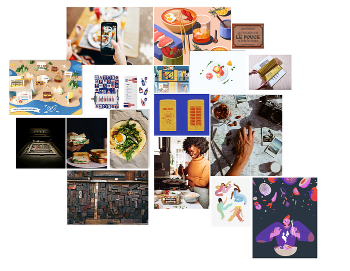
Thanks to the feedback, we were able to extract our colour palette from the moodboard we had made, and we quickly came to an agreement.
Style title
We chose to keep the colour close to red, which is the original colour of Salive, but we incorporated a bit of orange to make it a bright and modern salmon pink. It is warm, friendly, but less aggressive than a pure red. Dark blue evokes travel, the sky, the sea, escapades, but also softness and fun when it is pastel light. Why not both? As for the yellow, it is lively, dynamic, tasty, it will be very precious to us to add a little energy to our so wise blues.
The typeface is Avenir, a very modern and timeless sans serif that will fit perfectly with all Salive’s offerings.

And if you mix all the above things well, you get a brand new website!


Learnings
For my part, I learned that customer interviews are just as important as user interviews. Sometimes people want to convey a mood, a message, and you don’t necessarily feel that when you’re looking at a finished product. It’s important to know the motivations behind the project so that we may give the sites and applications a little more personality.
A good team is about getting the best out of each other, keeping an open mind, being compassionate and forgetting your ego. Our team was very complementary as we each had different knowledge due to our previous experiences, which made the whole project very enlightening.
I hope you enjoyed our work and find that we gave Salive a new skin that may suit it better, I really like this concept and we put a lot of work into it. Please book one of their amazing tours!
